top of page
However, after conducting the usability study, I observed that most participants wanted to access the services on the home page. It creates a more coherent and easy-to-follow story. Concise instructions are also added underneath each service to make them clear.
In the previous design, the services that the brand provides were on a separate page. It was accessible from the menu bar.
AFTER


BEFORE
A call-to-action button was added to make accessing the shopping list easier. Instead of clicking on every item, the user simply uses the button for the whole list. Moreover, the horizontal image is vertical in harmony with the vertical nature of mobile screens.
The shopping list further down the page was horizontal, making it hard to click on the furniture images one by one.
Now, the image is vertical which creates a more mobile-friendly experience.

AFTER
A call-to-action button was added to access the shopping list with just one click.
You were supposed to click on the tiny images one by one.

BEFORE
The image gallery system turns into a more independent one where you can see the images one under the other. It is now more inclusive and accessible compared to the previous design with the minimum required font size.
The current website was not responsive. The mobile design was the same as the desktop, with the image galleries with arrows and a one-by-one clickable shopping list. The font size was smaller to serve all types of users.
image gallery
with arrows

AFTER
back button for a more user friendly experience

BEFORE
CHALLENGE #3
images one under the other
a more organized and legible intro
After the interviews, I saw that the previous design was not easy to use both on desktop and mobile. I needed to simplify the design, provide clear and concise instructions, and make the mobile design more responsive to ease the overall experience.
icons for a more fun language
Making the existing design more user-friendly
3
The main goal was not clear once you go to the website
2
There was no defined target audience whose opinions were taken
1
TARGET
The main goal of the platform is to offer a user-friendly interface where clients can seamlessly collaborate with expert designers, visualize their ideas through virtual room designs, and conveniently shop curated furnishings to transform their spaces from the comfort of their homes..
CHALLENGEs
Storie Design is an innovative online platform offering personalized interior design and decoration services. It combines creativity, technology, and convenience to
make interior design accessible and enjoyable for everyone.
Working adults are too busy to spend time on in-person interior design services
1
TIME
It is costly to have an in-person design service
3
MONEY
People are not knowledgeable about design styles and cannot visualize the end result in 3D form.
KNOWLEDGE
CHALLENGE #1

The previous design was not formed considering the target audience and the successful competitors on the market.
user research
I interviewed over 30 people aged 25-45 and created empathy maps to understand the users I was designing for and their needs. It helped me to understand customer requests, pain points, and their wishes clearly.

Interviews foster empathy toward users, helping to foster more human-centered solutions by deep diving into users' minds. By listening to users about their experiences, problems are more likely to be identified, leading to effective solutions.
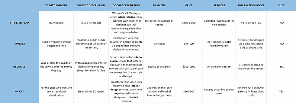
I analyzed the market to determine market segmentation and product differentiation and to understand how competitors solve similar problems and identify opportunities.
MARKET research
As the online interior design is a huge market, there were so many competitors to study. The price range, the emphasis of their brands, and the target audience they chose were all different from the other. However, seeing the median of the popular brands helped me where to place Storie Design in the market.
pain points
1
2
TIME
KNOWLEDGE
3
1
1
KNOWLEDGE
MONEY
Now, the first thing users see is a huge image that makes the perception of the website more straightforward, and the brief sentences emphasize the main point verbally one more time.
The home page is your online introduction—deciding whether visitors explore or exit in a blink. The previous design was full of text that tried to explain everything verbally. However, it contrasted with reality on a website that claims the best visuals to its users.

AFTER

BEFORE
CHALLENGE #2
It is very important to grab the viewer's attention in the very first 5 seconds. The main goal was not clear once you first see the home page. According to the findings I got from the interviews, it was creating hesitance to move on.
illegible writings based on their font size
less writing with legible bigger fonts
Call-to-action button to make
navigation easier
contrast ratio needs improvement for a better visual experience
The stronger your presence, the more trust you can build with your audience. I designed Storie's social media identity to create a positive brand perception from head to toe.
SOCIAL MEDIA PRESENCE
Storie is a brand communicating with the users, like telling a story. Unlike its competitors, the detailed explanations of its projects make the whole website look like a physical catalog to inspire more people.
To maintain that unique characteristic of the brand, I used colors to differentiate the projects from one another. With the help of the designated colors, it is easier to distinguish where one project starts and ends.


THE PATTERN BY COLORS

The prototype designed on Figma helped me test the design in a realistic context and get feedback from real users. It is crucial to identify usability issues, pain points, and areas for improvement, which can then be addressed in the design.
low-fidelity PROTOTYPE
In the light of the research done, the prototyping process has started.
I conducted interviews, paper and digital wireframing, UX analysis (flows), low- and high-fidelity prototyping, designing the brand logo, and iterating on the UI.
RESPONSIBILITIES

bottom of page

