top of page

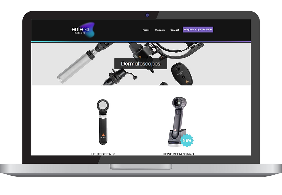

a more sleek design
AFTER
BEFORE
After removing the "Contact Us" form from the home page, it became more organized and neat. By taking advantage of the contrasts, it is more visually pleasant and easier to distinguish the sections..
AFTER
BEFORE
final Product
After the feedback on the prototype, the final changes were made, and it was ready to publish. Here are the before and after visuals of the website and their comparisons.
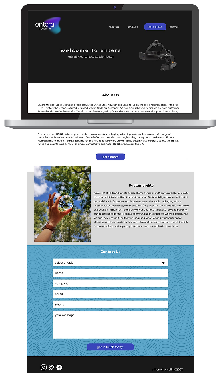
The first draft didn't have visual consistency or a pleasant first impression of the brand. Moreover, after the meetings with the client, we agreed that the "Contact Us" form on the home page was unnecessary.

The first prototype of the pages didn't have layers that created the perception of depth. There was no sense of where the elements began and ended.
After the revisions, we decided on the most user-friendly design that consisted visual hierarchy on each page. The minimal design and contrast colors provide clearly visible and unambiguous means of navigating to other content.
BEFORE
AFTER
more emphasis on products
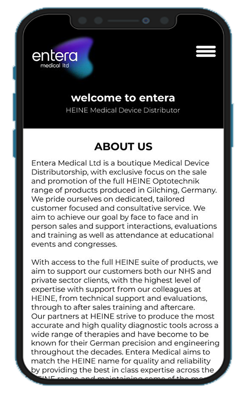
The ratio of verbal explanations decreased to eliminate the crowd on the homepage. Instead, product images were used for a simpler and more efficient language to increase accessibility.
The mobile version welcomed the users with unnecessary information that caused confusion and loss of interest in the first couple of seconds. The website was not accessible to all users.
TARGET & challenge
The main goal of the website is to offer a user-friendly and easy-to-use interface where clients can seamlessly communicate with the distributor. The challenge was to keep the explanations brief and clear at the same time in order to increase the emphasis on the contact info.

Entera Medical Ltd is a specialized medical device distributor in the UK with a key focus on the sale and promotion of the full HEINE Optotechnik range of products produced in Gilching, Germany.
HIGH-FIDELITY PROTOTYPE
The very first try of the high-fidelity prototype on Figma is the polished simulation of the product. Getting feedback from the client on the areas to improve is important to then be addressed in the design.
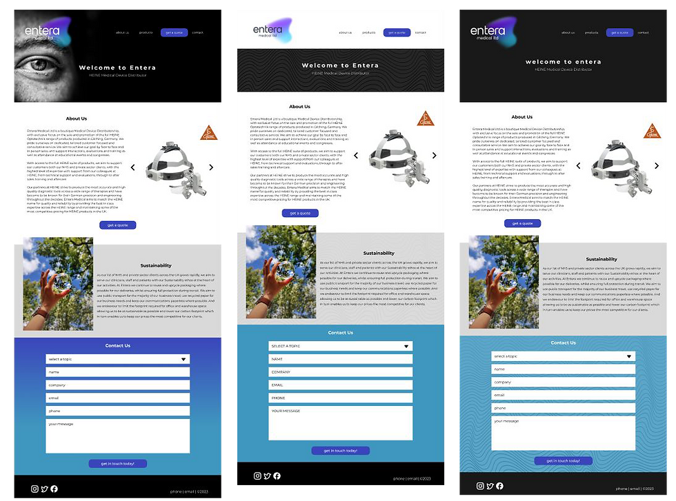
The first high-fidelity home page designs based on the feedbacks from the low-fidelity wireframes.
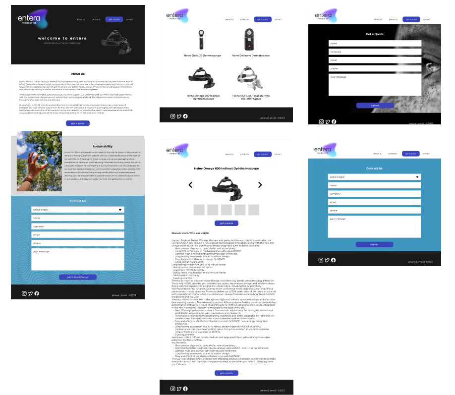
After discussing the optimal home page design, the flow of the website was prepared on Figma. Seeing the overall flow and potential design is crucial for both me as the designer and the client to make the essential improvements later.

For the best responsive design experience, I prepared a high-fidelity prototype to show how it looks on mobile screens.

The wireframes designed on Figma for the home page helped me outline the blueprint for the web page. Before jumping into the specific design decisions, it is crucial to construct the skeleton of the website.
low-fidelity wireframes
I was responsible for paper and digital wireframing, UX analysis (flows), low- and high-fidelity prototyping, iterating on the UI, and search engine optimization (SEO) on Wix.
RESPONSIBILITIES
bottom of page
